Project Overview
Background
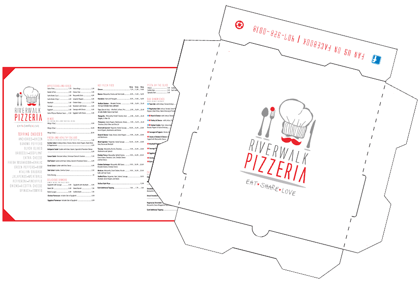
This client contracted me to help them upgrade their branding to coincide with a remodel and expansion to offer on-site dining. The new logo would be applied to signage, menus, table tents, packaging, uniforms, websites, and social media, etc. They have since grown to two locations and added a local brewery to their endeavors.
Client Concerns
The client was displeased with their current logo for the following reasons:
- The typeface is not readable and doesn’t reproduce well
- Too many colors
- Too busy overall
- Graphics do not reproduce well
- Too much emphasis on graphics instead of name
Client Direction
The client provided the following design direction so that focused exploration could begin.
- Use a maximum of 2-3 colors + black
- Must work as well in black / white or variation provided
- Avoid cliche Italian Pizza Place look using red, green, and white
- Going for a modern and corporate feel but still family-friendly
- Likes the idea of clean, simple, classic
- Mention made of Chipolte and Four Rivers
- Mention made of the use of a simple tomato
Primary Tools Used
Adobe Illustrator
Adobe InDesign
Adobe Acrobat
Zoom
Budget
$$
Total Time Spent
X hours
Work Performed
Redesign of logo with two options given. Production artwork created for reusable and to-go menus along with pizza box packaging. Minor bug fixes to existing website.
Related Project
Menu and Pizza Box